

Why Clarity Beats Cleverness
A practical guide to editing homepage copy for clarity, with before-and-after examples, a line-by-line worksheet, and guidance on when wordplay actually fits.
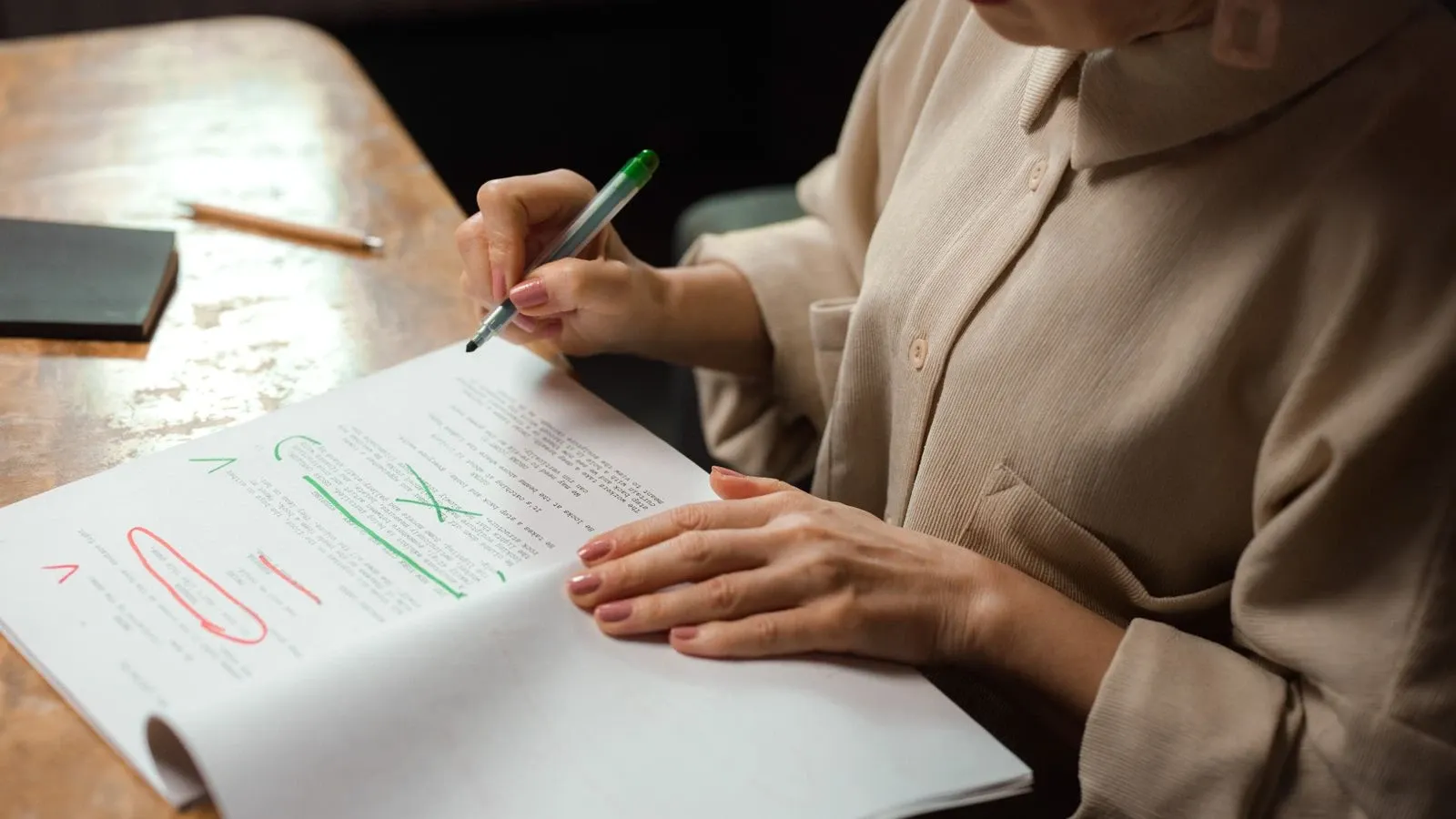
Clarity beats cleverness on a homepage because visitors arrive with a task or a worry, not a desire to decode your wordplay. When copy is plain and specific, readers have less wording to decode. Whether that improves trust or signups needs to be tested. Cleverness can still have a place, but only after comprehension is secured.
What "clever" and "clear" actually mean
Clear copy names the user, the problem, and the outcome in everyday words. A visitor can grasp the offer in a few seconds without rereading.
Clever copy asks the reader to solve a small puzzle first. It might lean on a metaphor, a pun, an inside joke, or a vague aspirational phrase. The puzzle can feel rewarding to the writer, but it adds friction for the reader.
The distinction is not about intelligence. It is about effort. Clear writing respects the reader's time. Clever writing, when it appears too early, spends that time on style before substance.
Why clarity builds trust
Trust on a website forms quickly and is shaped by many factors. Stanford's Web Credibility Project, based on research with over 4,500 people, offers ten guidelines for building credibility. Several of them point directly toward clarity: make your site easy to use and useful, write in a clear and sincere style, avoid errors, and design the site to match its purpose.
The underlying pattern is simple. People judge a site partly by how much effort it demands. A homepage that explains itself plainly signals competence and respect. A homepage that hides its meaning behind clever phrasing can feel evasive, even when the intent was only to be memorable.
Clarity alone does not guarantee trust. Product quality, pricing, proof, accessibility, and support all matter. But clarity is often the first gate. If a visitor cannot tell what you do, none of the other signals get a chance to work.
A three-second comprehension test
Before publishing any homepage copy, ask one question: can someone who has never heard of the product explain the offer in three seconds?
If the answer is no, the copy needs work. This test does not require a lab or a large budget. Show the headline and first supporting line to a friend, a colleague, or a test participant. Ask them to say back what the product does. If they hesitate, paraphrase incorrectly, or ask a clarifying question, the copy is not clear enough.
The three-second rule is a diagnostic, not a style preference. It forces the writer to prioritize comprehension over personality.
Before-and-after examples
These examples are fictional and illustrative. They show the kind of shift that clarity work involves.
Vague headline
Unleash the future of effortless storytelling
Clear headline
Create a video from a script in minutes, without a camera
The first version sounds energetic but says nothing specific. The second names the input, the output, and the constraint.
Clever subheading
Where imagination meets the lens
Clear subheading
Type a script, choose a voice, and get a finished video you can share
The clear version gives the visitor a mental model of the workflow. The clever version gives them a feeling and no information.
Vague call to action
Begin your journey
Clear call to action
Create your first video
The clear CTA tells the visitor what will happen next. The vague one asks for commitment without saying what the commitment is.
A line-by-line editing worksheet
Use this worksheet on a single section of homepage copy, such as the hero or the signup area.
- Name the user. Does the line address a specific person with a specific need, or does it speak to everyone and no one?
- Name the problem. Is the pain point stated in plain language, or is it implied through metaphor?
- Name the outcome. Does the visitor know what they will get after using the product?
- Check for jargon. Would a non-specialist understand every word without a glossary?
- Check for metaphor. Does the line rely on a comparison that must be decoded before the meaning lands?
- Check the verb. Is the action concrete, such as "create," "send," or "record," or abstract, such as "unlock" or "elevate"?
- Check the length. Can the line be read aloud in one breath?
- Check the CTA. Does the button say what the visitor will do, not just how they should feel?
Work through the worksheet line by line. Rewrite anything that fails a check. Then run the three-second test again.
Comprehension-test questions
After a rewrite, ask a small group of people who are not familiar with the product to answer these questions:
- What does this product do?
- Who is it for?
- What problem does it solve?
- What should you do next?
- Is there anything confusing or unclear?
Collect the answers without prompting. If two or more people give materially different answers to the first question, the copy is still ambiguous. If anyone asks what a word means, flag that word for replacement.
This kind of testing is informal but useful. It catches the gap between what the writer intended and what the reader received.
When cleverness can work
Cleverness is not forbidden. It simply belongs in a different position.
Once a visitor understands the offer, a well-placed line of personality can make the brand more memorable. Campaign pages, social posts, and secondary messaging can afford more wordplay because the core comprehension has already happened elsewhere. Established brands with strong category recognition can also lean into cleverness more safely, because visitors arrive with prior context.
The rule is sequencing, not elimination. Clarity opens the door. Cleverness can decorate the room after the visitor is inside.
Clarity does not mean bland
A common worry is that plain language will make a brand feel generic. The opposite is usually true. Clear copy can still carry warmth, rhythm, and a distinct point of view. The difference is that personality is layered on top of meaning, not used as a substitute for it.
Write the clear version first. Then read it aloud and adjust the tone. Short sentences, everyday words, and concrete verbs can still sound like a person wrote them. In fact, they often sound more human than a polished slogan.
A worked example
Imagine a fictional tool called Presently that turns written notes into a slide deck.
The original hero copy reads:
Transform your thoughts into visual symphonies that resonate with every audience.
A clarity edit might produce:
Turn your notes into a slide deck in minutes.
The second version is shorter, more specific, and easier to verify. It tells the visitor what the tool does and what they will get. It is not flashy, but it is useful.
The subheading could then add warmth:
No design skills needed. Paste your notes and get a clean deck you can edit.
This keeps the plain meaning intact while adding a reassuring tone. The personality comes through in the phrase "no design skills needed," not in a metaphor.
Limitations to keep in mind
Clarity is necessary but not sufficient. A clear homepage can still fail if the product is hard to use, the price is unclear, the page loads slowly, or the site is inaccessible. Clear copy also cannot compensate for a broken signup flow or a product that does not deliver on its promise.
Treat clarity as one part of a broader trust-building effort. It is a strong first step, not a complete strategy.
A practical ending
Start with one section of your homepage. Run the three-second test. Work through the worksheet. Rewrite the lines that fail. Then ask a few people the comprehension questions and see what changes.
The goal is not to strip away personality. It is to make sure the meaning arrives before the style does. When clarity comes first, cleverness becomes a choice rather than a crutch.
Related reading
More from Kyndrify


The tools that do this
Make your first video without filming.
Say what you need and the studio makes it: video, images, voices. Start free, no credit card.