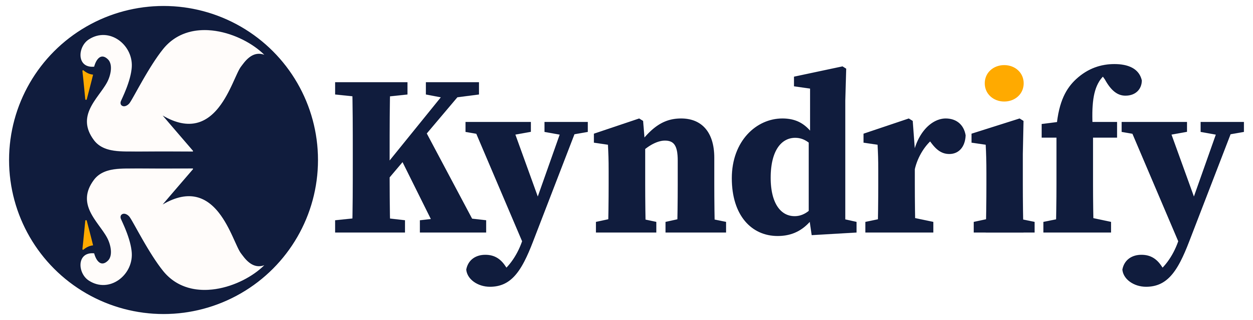

Who Designed the Kyndrify Logo?
The story behind our trustworthy mark for an AI video product and who designed it.
Who Designed the Kyndrify Logo?
When we started creating Kyndrify’s visual identity, we knew the logo had to do more than just look good. It needed to reflect what we stand for.
The Power of First Impressions
We were not just designing a logo. We were shaping perceptions. A Stanford web-credibility study found that 46.1 percent of participants' credibility comments referred to visual design. A logo is only one part of that experience, but it helps set the tone. So we took it seriously.
Our mark had to feel approachable yet professional. It needed to be simple but meaningful.
Keeping It Clear and Trustworthy
We aimed for something clean and uncluttered. The logo should be instantly recognizable, even at a glance. No overly complex shapes or hard-to-read fonts. We wanted a clear, trustworthy mark that people could connect with right away.

This wasn’t just about looks. It was about building trust from the first moment someone saw our name.
The Role of Color and Typography
Color plays a big part in how people see brands. We chose warm, inviting colors. These colors wouldn’t intimidate but would put people at ease. The typography had to be easy to read yet distinct.
Why This Matters for AI Video
AI video is still new to many people. When we ask them to trust us with their presence on camera, the last thing they need is a cold or impersonal logo. Our mark had to feel like a friend, not a robot.
The Design Process
We didn’t do this alone. We worked closely with an award-winning Dubai creative agency, a Dubai creative studio. They understood our vision from the start. They helped us refine every detail. This ensured the logo felt true to who we are as a company.
A Mark That Grows With Us
One of the best parts about working with TTGC was their ability to create something timeless. Our logo isn’t just for today. It’s built to evolve with us as Kyndrify grows. Whether we’re expanding our features or reaching new audiences, this mark will always feel like “us.”
Final Thoughts
At the end of the day, a logo is more than just an image. It’s a promise. It shows what your brand stands for. We wanted ours to feel trustworthy, approachable, and human. And we’re proud of how it turned out.
This perspective reflects our own experience as Kyndrify’s founders. It isn’t professional advice.
Related reading
More from Kyndrify
The tools that do this
Make your first video without filming.
Say what you need and the studio makes it: video, images, voices. Start free, no credit card.