

Why Our Homepage Explains Instead of Impresses
A practical framework for mapping homepage sections to visitor questions, placing proof and next actions, and checking whether readers understand the offer.
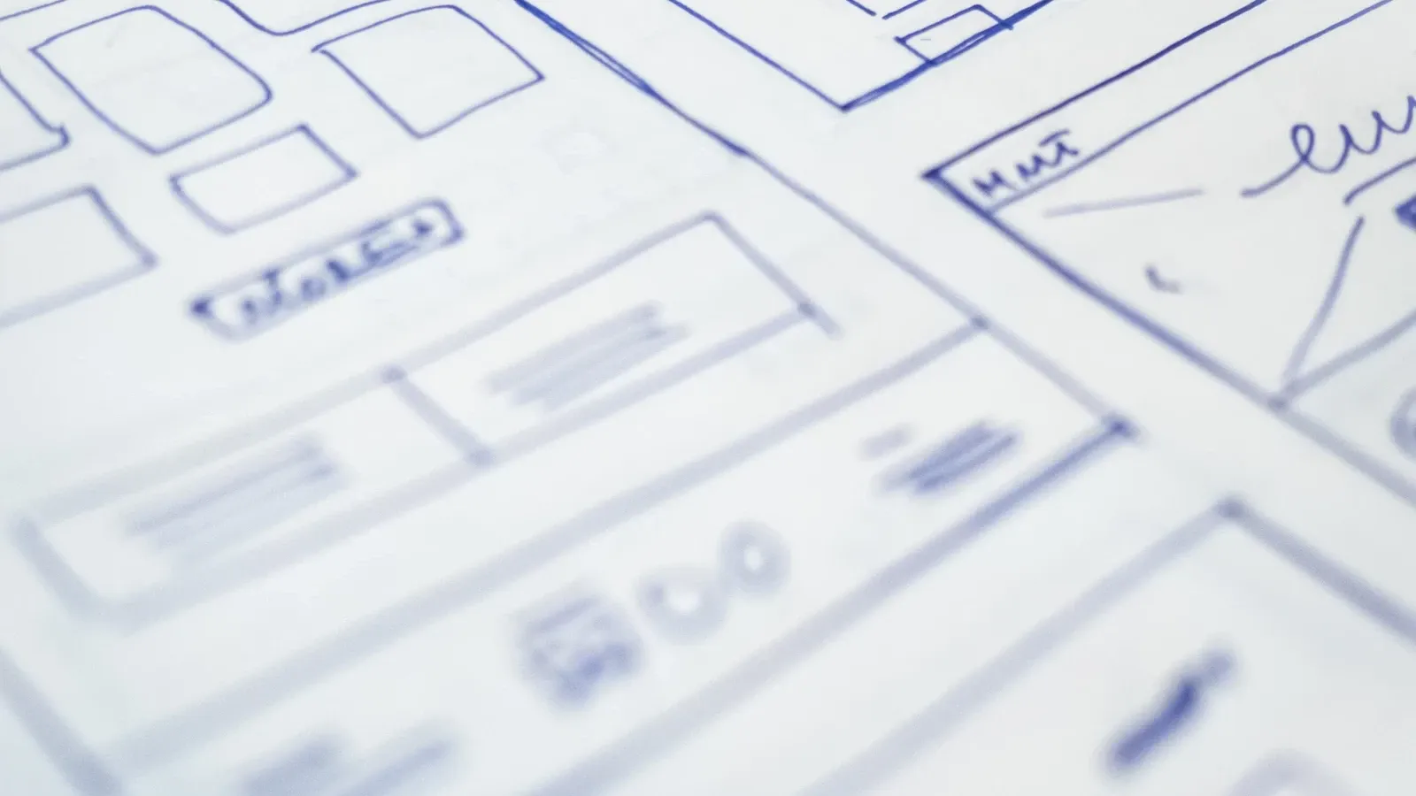
A homepage should be judged by whether a first-time visitor can answer three questions in seconds: what is this, who is it for, and what should I do next. That is a comprehension test, not an aesthetic one. A page can be visually striking and still fail it. A page can be plain and pass it easily.
This article is a working framework for homepage information architecture. It maps visitor questions to sections, places proof and next actions deliberately, and proposes a lightweight comprehension test you can run without claiming results you have not measured. It draws on published credibility research and Kyndrify's current product pages as an example, not as evidence of past experiments.
The core tension
Many homepages try to impress before they explain. The team invests in animation, clever copy, or a bold visual concept. Visitors arrive with a need and limited patience. They are not asking how creative the team is. They are asking whether this page understands their problem.
Explanation and visual craft are not opposites. A well-designed page can be distinctive and clear at the same time. The Stanford Web Credibility Project, based on research with over 4,500 people, lists visual design as one of ten credibility guidelines. But it also warns against catering to a company's ego or showing off technology at the user's expense. The two ideas sit side by side: design matters, and clarity is part of design.
What a homepage must explain
A first-time visitor needs orientation before they need persuasion. Three questions do most of the work:
- What is this? The product, service, or offer in plain language.
- Who is it for? The audience or problem the page addresses.
- What should I do next? The single action that moves the visitor forward.
If a visitor cannot answer these after a quick scan, the page has not done its job. Everything else, proof, social trust, feature detail, supports these answers. It does not replace them.
Mapping visitor questions to sections
A useful homepage follows a sequence that mirrors how a visitor thinks. The order matters less than the coverage. Each section should answer one question and then hand off to the next.
| Visitor question | Homepage section | What it should do |
|---|---|---|
| What is this? | Hero and subheadline | Name the offer and the outcome in plain words |
| Who is it for? | Audience or use-case line | Show the reader they are in the right place |
| Why should I believe you? | Proof section | Show real evidence: customers, results, credentials |
| How does it work? | Steps or process | Reduce perceived effort and risk |
| What should I do next? | Call to action | Give one clear, low-friction next step |
| What if I have doubts? | Objection or FAQ | Answer the top concerns before they leave |
This is not a rigid template. A local business may need a map and hours before a process section. An enterprise product may need security and compliance proof earlier. The principle is the same: every section earns its place by answering a question a visitor actually has.
Proof placement
Proof works best when it appears next to the claim it supports. A testimonial about speed belongs near the section that promises speed. A credential belongs near the claim it validates. Proof far from a claim may be missed by readers who stop before that section.
The Stanford guidelines make a related point: showing that a real organization stands behind the site, with verifiable details, builds credibility. That means a physical address, clear contact information, and evidence of expertise. These are not decorative. They are part of the explanation.
The next action
A homepage should offer one primary next action. Secondary actions can exist, but they should not compete. If the page offers "Start free," "Book a demo," "Read the docs," and "Join the newsletter" with equal weight, the visitor has to choose. Choosing is work. Work is friction.
The primary action should match the visitor's likely intent. A visitor who arrived from a search ad may be ready to try the product. A visitor who arrived from a blog post may need more context first. The homepage cannot know every source, but it can make the default path obvious and let secondary paths recede.
A proposed comprehension test
You can test whether a homepage explains without claiming conversion results. The method is simple and does not require analytics.
The five-second test. Show the page to someone unfamiliar with the product for five seconds. Close it. Ask them what the page offers and who it is for. If they cannot answer, review the hero and repeat the test. Five seconds is a proposed test length, not a universal attention limit.
The message-match check. Look at the page a visitor would see after clicking an ad, email, or social post. Does the headline continue the promise that brought them there? A mismatch between the source and the landing page is a common failure that no amount of design polish fixes.
The objection scan. List the three most common reasons someone might hesitate. Does the page answer them? If not, where would those answers go?
The CTA clarity check. Read every button and link on the page. Does each one say what it does? "Learn more" is weaker than "See how it works." "Submit" is weaker than "Start free."
The mobile scan. Open the page on a phone. Scroll once. What is visible? The first screen on mobile is smaller than on desktop. If the explanation depends on a large hero image or a multi-column layout, it may not survive the most common viewport.
Record the questions people answer well and the points they miss. A small test can reveal unclear sections. It cannot establish a conversion gain or represent every visitor.
What to remove
Clarity comes from removal as much as addition. A section that does not answer a visitor question is a candidate for deletion. Common candidates include:
- Internal milestones or company history that new visitors do not need.
- Feature lists that describe capabilities without connecting them to outcomes.
- Decorative sections that repeat what the hero already said.
- Multiple competing calls to action.
- Jargon that only insiders understand.
The test is not whether a section is true or well-written. It is whether a first-time visitor would miss it if it were gone.
The Kyndrify example
Kyndrify's talking-head product page shows this structure in practice. The page opens with a plain statement: "The AI talking head generator that puts your real face on screen." The subheadline explains the mechanism: type a script, and your Digital Twin says it in your own voice. The next action is explicit: "Get started for free."
The page then answers the visitor's likely questions in order. What is an AI talking head generator? Who is it for? What do you need? What does it cost? What does it not do? Each section is short and specific. The "How it works" section reduces the process to three steps: build your Digital Twin, write your script, render. The FAQ answers objections directly, including the question of whether it actually looks like you.
This is not presented as a case study with measured results. It is an example of a page structured around visitor questions. The same structure would work for a service business, a course, or a local shop. The content changes. The sequence does not.
When visual craft helps
Visual design is not the enemy of explanation. A clear page can be beautiful. A beautiful page can be clear. The Stanford guidelines list professional visual design as a credibility factor, with the caveat that the design should match the site's purpose.
Animation and brand expression can support understanding when they do real work. A short product demo can explain faster than a paragraph. A diagram can show a process that words would make tedious. A consistent visual system can signal care and competence. The problem is not craft. It is craft that replaces explanation instead of supporting it.
The test is the same: does the visual element help a visitor answer one of the three questions? If it does, keep it. If it only impresses, it is decoration. Decoration is fine in small doses. It should not carry the page.
Edge cases
High-awareness visitors. Someone who already knows the product may not need the full explanation. But the homepage serves first-time visitors too. A clear page does not bore returning visitors. It simply does not confuse new ones.
Enterprise buyers. A homepage for an enterprise product may need to answer different questions: security, compliance, integration, procurement. The structure is the same. The questions change.
Brand-led businesses. Some businesses sell an identity or a feeling more than a function. A fashion label or a creative studio may lead with imagery and mood. Even then, a visitor still needs to know what the site offers and what to do next. The explanation can be shorter, but it cannot be absent.
Traffic source mismatch. A homepage cannot be optimized for every source. But it can be checked against the most common sources. If paid traffic lands on the homepage, check the message against the specific ad. If most traffic is direct or branded, the homepage can assume more context.
Frequently asked questions
Does a clear homepage have to be boring?
No. Clarity and distinctiveness are separate qualities. A page can have a strong voice, a memorable visual identity, and a clear explanation at the same time. The constraint is that the voice and visuals serve the explanation, not replace it.
How long should a homepage be?
Long enough to answer the visitor's questions, short enough to avoid repeating itself. There is no universal length. A complex product may need more sections. A simple offer may need three.
Should every section have a call to action?
No. One primary action is usually enough. Repeating the same action at natural decision points can help, but competing actions create friction.
What if I cannot test with real users?
The five-second test works with a colleague, a friend, or anyone unfamiliar with the page. The point is not statistical validity. It is catching obvious failures before they reach real visitors.
A working checklist
Before publishing or revising a homepage, run through this list:
- A first-time visitor can say what the page offers in one sentence.
- The page names its audience or the problem it solves.
- One primary next action is obvious.
- Proof appears next to the claims it supports.
- The top three objections are answered somewhere on the page.
- The mobile first screen shows the offer and the next action.
- Every section answers a visitor question or is removed.
- Visual elements support understanding rather than replacing it.
This checklist is a starting point, not a guarantee. Homepage strategy depends on audience, traffic source, and business model. But the underlying test is stable: a page that explains is a page that respects the visitor's time. That respect is the foundation of trust.
This article reflects an editorial perspective and general information. It does not constitute professional advice, and it does not report measured results from Kyndrify or any other site.
Related reading
More from Kyndrify



The tools that do this
Make your first video without filming.
Say what you need and the studio makes it: video, images, voices. Start free, no credit card.